
Core Drupal 8 Provides Mobile First Responsive Design with Built-in Drupal Themes
Due to the Mobile Initiative, Drupal was the first major content management system (CMS) to be mobile friendly out-of-box from the installation to the authoring experience to built-in themes. For example, the BYU Sophie site we recently migrated uses the Bartik theme shipped with Drupal 8. Being able to use a built-in Drupal 8 theme with only a few tweaks wound up saving significant time and cost to BYU.
What is a Drupal Theme? Think of themes as the Website's skin. Themes dictate the look and feel of Drupal websites. Themes are made up of template files, HTML (page structure), CSS (page design), Javascript (dynamic page elements), media specific to your site, and other assets. Themes typically provide a great starting point for your design, and can often be tweaked to give you the design you envisioned. There are hundreds of free and premium license-based themes that can be purchased for under $50.
In fact, we had planned a second phase to deliver a responsive design, but, thanks to the time we saved on the migration mentioned above, we were able to include the design in the first phase deliverable.
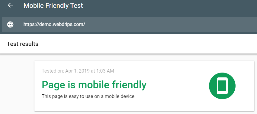
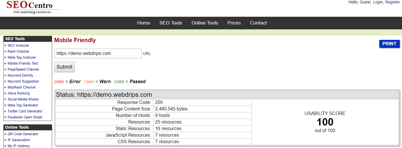
This Drupal 8 demo passed Google's mobile-friendly test.
Drupal 8 ships with a nice administration theme that's also fully responsive, allowing content creators to add/edit content from their phone or tablet.
Mobile-First Responsive Everywhere in Drupal 8
Given the worldwide trends of mobile vs. desktop website use, it's equally important website themes support both platforms well across devices, browsers, and operating systems. Every portion of core Drupal 8 themes provides responsive designs consumable by mobile devices. This is true for the theme visitors see (so long as you select a responsive theme or use one built into Drupal 8) to the ones editors see when using the authoring environment.
This eliminates the need to pinch and push on the screen to zoom in and out, respectively. It also adds elements like hamburger menus to make sites much more intuitive on mobile devices. Users are far less likely to bounce from your site while visiting it on a mobile device if it's responsive. Your website will be dinged by search engines when searching on mobile devices if your site is not mobile friendly.
Let's examine the ways Drupal 8 provides a nice mobile experience via responsive design out-of-box.
All Core Drupal 8 Themes are Responsive
All built-in (core) Drupal 8 themes are responsive. Items such as menus, blocks, and images all scale and have a vertical flow applied automatically for a better mobile experience. Drupal 8 also allows site builders to specify different styles for images that can be set for different view ports to support a variety of mobile devices.
Drupal 8 supports responsive tables. Responsive tables support each column to be declared high, medium, or low importance. Wide screens (desktops) will show all columns. As the screen size decreases, columns of lesser importance drop off, so that tables show up nicely regardless of the device.
Drupal 8 Core Themes Provide a Responsive Authoring Environment
The Drupal 8 community recognized that sometimes website edits need to be made on mobile devices. All Drupal 8 core themes will work with mobile devices nicely while adding or editing website content, site building, etc. The toolbar is also mobile friendly, and will provide a vertical orientation on mobile devices.
Improved Mobile Performance with Core Drupal 8 Themes
Search engines now punish you (via lower page rankings on mobile devices) for poor mobile designs, and the users are more likely to bounce from your site if it's too slow. Drupal 8 addresses both issues by minimizing the front-end footprint of your website, along with many other performance improvements built-in. The combination of better performance and a mobile friendly design will keep search engines and your mobile visitors happy.
Conclusion
Drupal 8 is extremely mobile-ready/responsive out-of-box, and many of the free available Drupal themes on Drupal.org and premium Drupal 8 themes on Theme Forest (and other sites) provide beautiful mobile experiences with little to no additional design effort required typically.
If you website is not responsive, or being dinged for slow page load speeds, consider upgrading to Drupal 8 today. You can edit this demo site live on your mobile device after requesting access using the button below.
